Page 1 of 1
Which picture best for calender?
Posted: Tue Jul 26, 2011 8:03 pm
by SUDS
Hello I was hoping some of ya would help me decide on which picture I should submit for the Calender contest.
Always a tough decision, thanks for the help! :)
(Pictures listed below number)
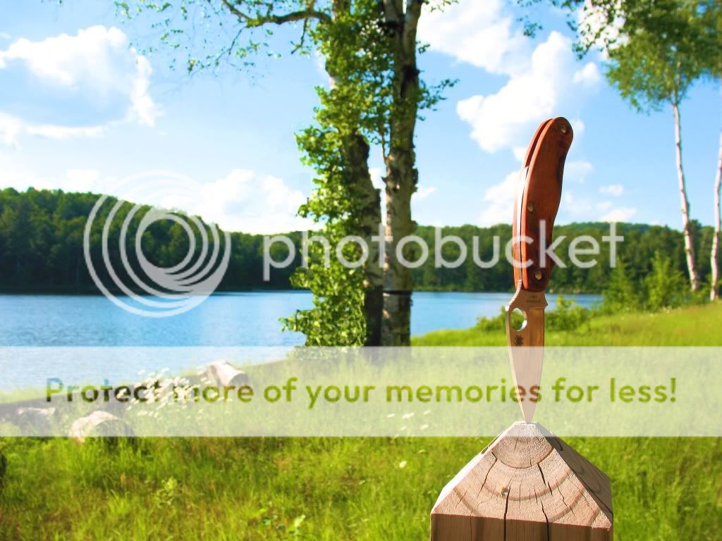
1
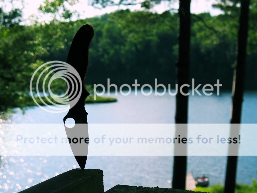
2
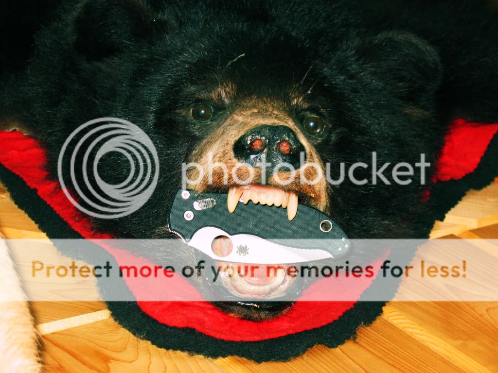
3
4
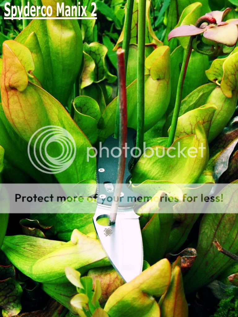
5
Posted: Tue Jul 26, 2011 8:21 pm
by SQSAR
I'd say photo number 1, and the number 5.
Posted: Tue Jul 26, 2011 8:42 pm
by dgulbra
I like 1
Posted: Tue Jul 26, 2011 8:50 pm
by I_like_sharp_things
Photo number 1 for sure.
Posted: Tue Jul 26, 2011 11:31 pm
by razorsharp
1,4 or 5 hmmmm, tough pick ,, probably 1
Posted: Wed Jul 27, 2011 1:02 am
by Pneumothorax
Gotta go in different direction...#2!!!
Great composition with the vertical shadows of the trees.
It is the ultimate Spyderco statement. You just see the outline. No need for knowing scale or lock type or steel or grind.
You can see the essences of Spyderco...ergonomic handle...choil...leaf shape blade...and the Spyder hole.
It says it all without having to say it!
Nice pic!
Posted: Wed Jul 27, 2011 2:11 am
by WalzAaronFFG
SQSAR wrote:I'd say photo number 1, and the number 5.
+1
I am wondering how they feel about mods in the Calendar though. I was thinking they might prefer production knives. I have no idea what i'm going to enter, but I don't think I am skilled enough to base my decision on anything but raw visual appeal. I can't be worried about which ones have mods or which ones are sprints.
Posted: Wed Jul 27, 2011 4:22 am
by Creepo
WalzAaronFFG wrote:
I am wondering how they feel about mods in the Calendar though. I was thinking they might prefer production knives. I have no idea what i'm going to enter, but I don't think I am skilled enough to base my decision on anything but raw visual appeal. I can't be worried about which ones have mods or which ones are sprints.
From the contest thread:
dapagco wrote:
Image must include a Spyderco product(s). Any product Spyderco has ever made is fair game. Product can be mint, used and abused, or radically modified. Your submission can be seasonal, retro, traditional, artistic, black and white, color, sepia, comedic or serious. Set your imagination loose. We want to see it all.

Oh and I like #2 most, followed by #1.
Posted: Wed Jul 27, 2011 4:23 am
by SDR
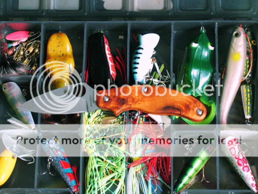
okay, weighing in on behalf of contrarians around the world, i'm loving #5. it just smacks of hot fun in the summertime. it would be a perfect june calendar shot!
#1 is a beautiful picture but the knife is not the focal point -- the lake is.
#2 the knife is obfuscated and swallowed by the shadows.
#3 begs the question: what happened to the guy/gal who owned the knife? the obvious possibility conjures an ugly image!
#4 uninspiring on many levels and certainly does not do justice to such a fine knife.
# 5 the colors! the colors! a wide array of vibrant colors in many shapes and sizes. my eye first zeroes in on the knife and then begins to explore the periphery. my eyes dance frenetically. aye! a veritable cornucopia of visual pleasures abound within that tackle box. yet, none so beautiful as the stately spydie as she reigns supreme with a subtle majestic dominance over her colorful kingdom.
*scratches head* did i mention that i kind of liked number five, already?
Posted: Wed Jul 27, 2011 8:01 am
by Donut
I like #2.
Posted: Wed Jul 27, 2011 11:55 am
by BAL
#1
Posted: Wed Jul 27, 2011 3:48 pm
by ragen
Number 4
Posted: Wed Jul 27, 2011 9:15 pm
by jabba359
I like the idea of #5 the best, but if possible, would retake the picture as the focus on the camera was set to behind the knife, making it look a little soft and drawing my eyes from the knife and onto the sharply focused lures. But that may be just me. I'm a camera operator and assistant for a living, so I really notice when the focus is off in an image.
I also like #2, as it has great composition, the silhouette is tack-sharp, and it is a little more interesting since it doesn't just show you knife outright.
#4 is great, but in the wrong orientation (taller than it is wide), on #1 my eyes keep getting drawn to the lake for some reason, and #3 is kind of fun, but the image itself isn't quite as artistic as the others you came up with.
Don't get me wrong, I like them all! Any criticism I offer is merely constructive and designed to help you get the best chance of winning! Keep up the good work.
Posted: Thu Jul 28, 2011 6:01 am
by The Deacon
Lovin' #3, and my second choice would be #5.
Posted: Fri Jul 29, 2011 12:17 pm
by SUDS
Thanks for the Comments everyone! I appreciate it
Posted: Sat Jul 30, 2011 12:13 pm
by D56
I like the color content of 5